DigiPak
- Jan 3, 2017
- 1 min read
This was our first draft of our digi-pak after creating it on Keynote we decided that the layout was too simple and did not use our photography to its full extent. We also didn't think it was as sleek or that it flowed as well and a complete product.

So to improve upon this we took our 6 side layout and expanded it to and 8 side layout. this meant the inlays could incorporate more photography and we had more space to rearrange it to flow.

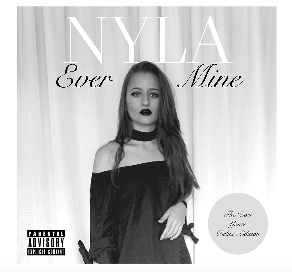
Above is our finished album cover. The artist is centre on the product as this is what we found from our research. The name of the Artist is the largest as our artist is new to the scene and up and coming meaning that we want people to remember her name. We made the disc a deluxe edition as this meant that we could include a live performance on disc 2 for example.

This is how the digipak looks when opened once to the second set of inlays. We felt this image worked perfectly for the flaps which will open along the middle black line and it enticed the customer to open it and also reflected the idea that they were bit by bit moving through the curtains and unveiling the real person behind the artist.

This is the centre inlay consisting of two discs and two side images.

The back cover includes legal jargon, our logo for our record company, a barcode, a lift of producers and the song lists for each disc.


Comments